Making Account Readiness Easier to Understand
A concept redesign that brings financial, operational, and compliance signals into one view before an order begins.
About this concept: An independent design exploration informed by my professional experience with legacy applications. The company, system details, and sample data are fictionalized. This concept has not been implemented or formally tested with users.
From Scattered Information to a Clearer Decision
Before processing an order, a customer service representative needs to answer a practical question: “Is this account ready to proceed?” That answer may depend on credit status, overdue balances, shipping information, contract requirements, and compliance checks.
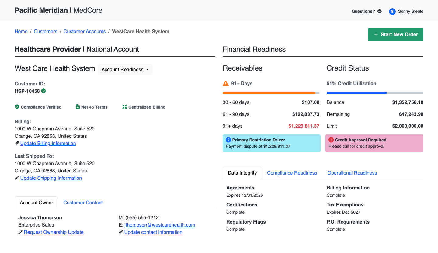
When those details live across several screens, the person taking the order must assemble and interpret them under pressure. I designed an account summary to bring important signals together, make potential blockers easier to recognize, and keep supporting details within reach.
Project Overview
The scenario centers on a fictional medical and surgical supply distributor using a customized Microsoft Dynamics GP environment. Financial, warehouse, and account information are spread across legacy screens and supporting tools.
My role covered workflow analysis, information architecture, interface design, and the visual concept. The scope focused on account review before order intake.
The design considers an existing ASP.NET Web Forms environment: familiar controls, restrained interactions, and a desktop layout. Data access and technical feasibility would require validation before implementation.
The Challenge
The challenge went beyond updating the screen’s appearance. Users needed to distinguish information that could stop an order from information that simply provided context.
A credit hold, an overdue balance, and a shipping issue have different implications. The screen needed to support a quick initial assessment while making deeper review possible when something required attention.
Skills Used
-
Operational Workflow Design
-
Information Architecture
-
Interface Design
-
Progressive Disclosure
-
Legacy Application Modernization
Bringing Important Signals Together
The proposed screen groups financial, operational, and compliance information around the account review decision. Customer and ownership details provide context, while credit and receivables information help identify concerns. The summary is read-only; changes and approvals remain in their appropriate source systems.
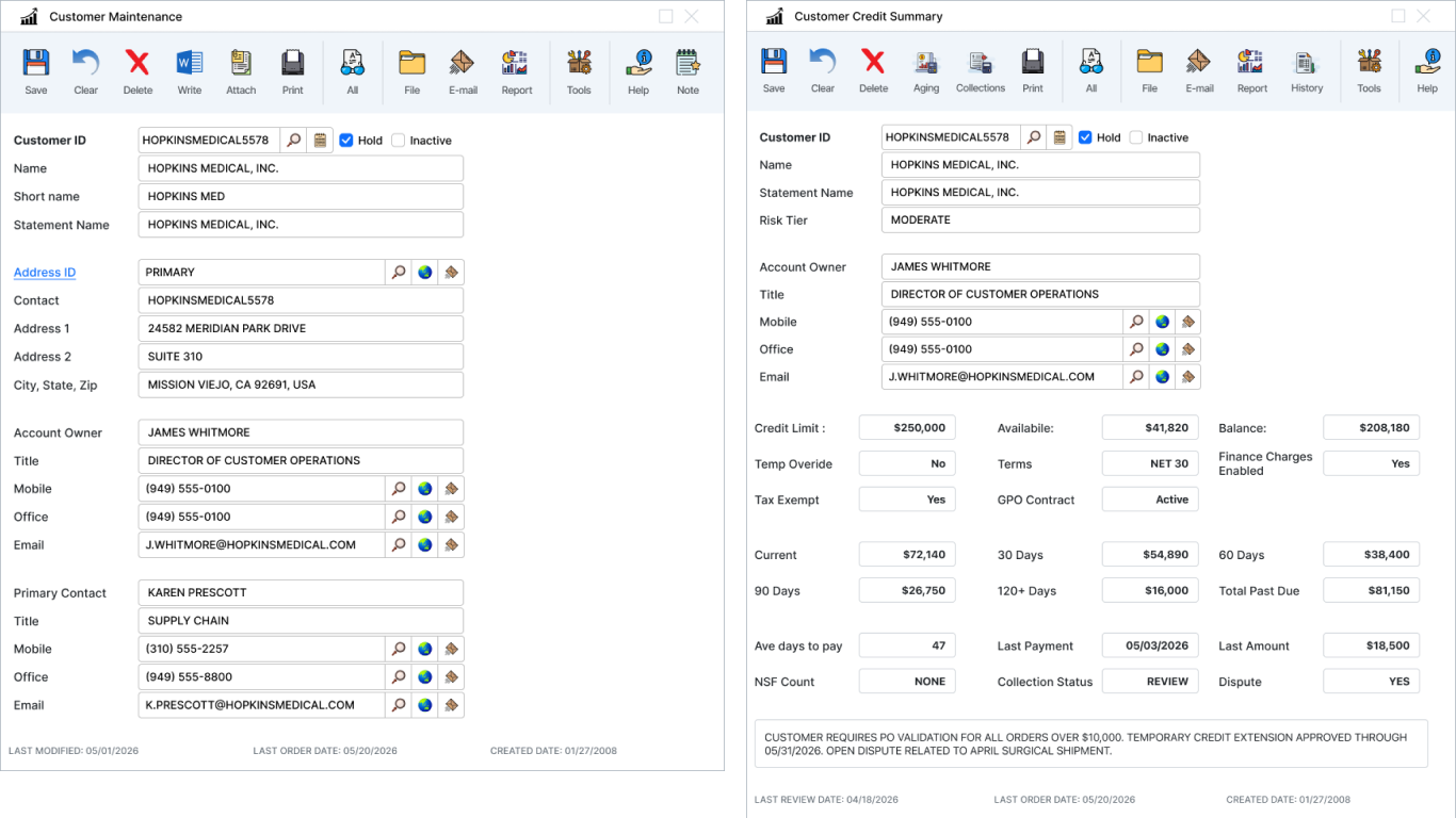
Move the divider to compare the legacy screens with the proposed account summary.
Making Potential Blockers Easier to Spot
Clear status wording and visual emphasis help people recognize what needs attention without relying on color alone. Relevant links provide a path to supporting information or the responsible team. The goal is to surface concerns early, before someone spends time preparing an order that cannot proceed.
Keeping Details Available Without Overloading the Screen
The initial view prioritizes information needed for a quick assessment. Supporting details can be revealed when needed, including address verification and additional account checks. Familiar controls and progressive disclosure help keep the screen focused while supporting a more thorough review.
Intended Benefits
- Fewer cross-screen checks during account review.
- Earlier recognition of issues that could delay an order.
- A more consistent starting point for readiness decisions.
What Needs Validation
These are design goals, not measured results. The next step would be reviewing the concept with customer service, finance, and fulfillment teams, then confirming data availability, freshness, and how the interface handles incomplete or unavailable information.
What This Means for Your Website
Website visitors face similar problems when they must piece together information across several pages before making a decision. They may need to compare services, understand requirements, or find out what happens after submitting a form.
The same UX principles apply: put important information first, explain potential obstacles before people encounter them, and make to find without overwhelming the main message.
Could Your Website Make the Next Step Clearer?
Let’s talk about where people get stuck and what could improve their experience.
Let’s Talk About Your Website