Turning Revenue Reports into Clearer Decisions
A dashboard concept that brings revenue, targets, and trends together so teams can see where performance needs attention.
An independent concept informed by my professional experience with enterprise applications. The organization, system details, and sample data are fictionalized to protect confidentiality. This redesign was not implemented, and its intended benefits have not been validated through formal user research.
From Revenue Percentages to Useful Context
A report can be accurate and still leave people without the information they need to make a decision. In this scenario, a legacy report showed each branch’s share of company revenue using a table and pie chart. It answered “How much did each branch contribute?” but left more practical questions unanswered.
Was a branch meeting its target? Was performance improving or declining? Where should a manager look more closely?
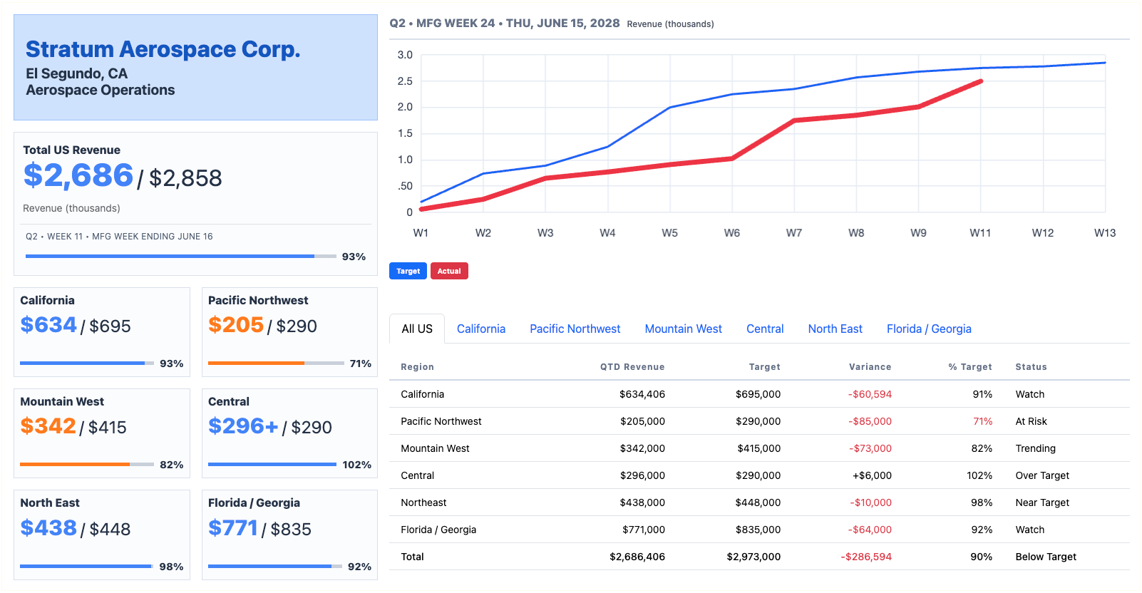
I explored a dashboard that pairs revenue with targets, performance gaps, and a 12-week trend. The goal was to make the report more useful within the existing ERP environment, while keeping the information understandable across desktop, tablet, and mobile screens.
Project Overview
The scenario centers on Stratum Aerospace, a fictional aerospace systems integrator with multiple manufacturing locations supporting commercial aviation and defense programs.
My role covered information architecture, dashboard design, data visualization, and responsive interface planning. The scope focused on one reporting experience within a legacy ERP.
The concept uses a responsive grid, lightweight components, and restrained visualizations. It also introduces information the original report didn’t show, including revenue targets and historical trends. The availability and consistency of that data would need technical validation before implementation.
The Challenge
A branch’s share of company revenue doesn’t tell you whether it is performing well. A large branch might contribute the most revenue while still missing its target; a smaller branch might exceed expectations.
The original report also hid some chart details behind hover interactions, making comparison harder and limiting their usefulness on touch devices.
The challenge was to provide meaningful context without creating a crowded dashboard that required just as much interpretation as the original report.
Skills Used
-
Information Architecture
-
Dashboard Design
-
Data Visualization
-
Responsive Interface Design
-
Progressive Disclosure
Showing Performance, Not Just Contribution
The original report emphasized proportional revenue contribution. The proposed dashboard adds targets, variance, and trends so users can assess performance against expectations.
Branches are grouped by geographic region, providing a manageable overview before users explore individual locations. Clear labels and numeric values support interpretation without depending on color alone.
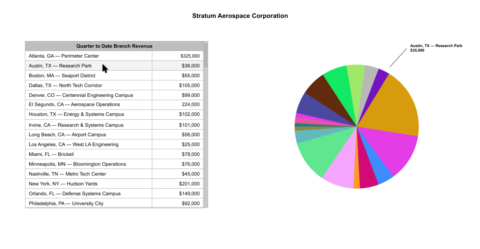
Compare the original branch contribution report with the proposed dashboard, which adds performance targets, regional context, and revenue trends.
Making Performance Gaps Easier to Recognize
Revenue and targets appear together, with the difference made explicit. Users can see where performance is above or below expectations without calculating it themselves.
A 12-week trend adds context to the current figures. It helps distinguish a single weak week from a longer pattern that may deserve investigation. Revenue values use compact formatting, such as $325K, to keep the display easier to scan.
Keeping the Dashboard Useful on Smaller Screens
The mobile layout prioritizes headline performance indicators, then provides regional and branch details through expandable sections.
This supports a quick review between meetings or while visiting another location. Touch-friendly controls replace reliance on hover interactions, while a vertical layout keeps information readable. The aim is to preserve access to useful detail without squeezing the entire desktop dashboard onto a phone.
Intended Benefits
- Less manual calculation and comparison during performance reviews.
- Earlier recognition of branches or regions that need attention.
- A shared view of revenue, targets, and trends across teams.
- Less need for separate spreadsheets to answer routine performance questions.
What Needs Validation
The next step would be reviewing the concept with regional leaders, operations managers, and reporting stakeholders. Their feedback would help confirm which metrics matter, how targets are established, and what decisions the dashboard should support.
Technical review would need to confirm historical data availability, reporting periods, refresh frequency, and performance. Testing should also cover missing data, touch interactions, and whether the charts and labels remain understandable across devices.
What This Means for Your Website
People visiting your website also need context before they can make a decision. A list of services, prices, or features may be accurate, but it can still leave them unsure which option fits their needs.
The same principles apply: organize information around the questions people are trying to answer, make comparisons understandable, and put important details within reach. On mobile, prioritize the essentials while keeping supporting information available. Clearer structure can help visitors understand their options and choose a next step.
Does Your Website Help People Make a Decision?
Let’s look at where visitors struggle to compare options, understand your services, or find the next step.
Let’s Talk About Your Website